Colour Psychology: How It Can Boost Your Business
Let’s take a look at the figures:
- A whopping 93% of consumers focus on the visual appearance of a product before purchasing.
- 85% say that colour is their primary reason for going ahead and deciding to hand over their money.
These figures make it clear that appearance and colour should be a prime concern in every marketing and advertising decision you make for your business.
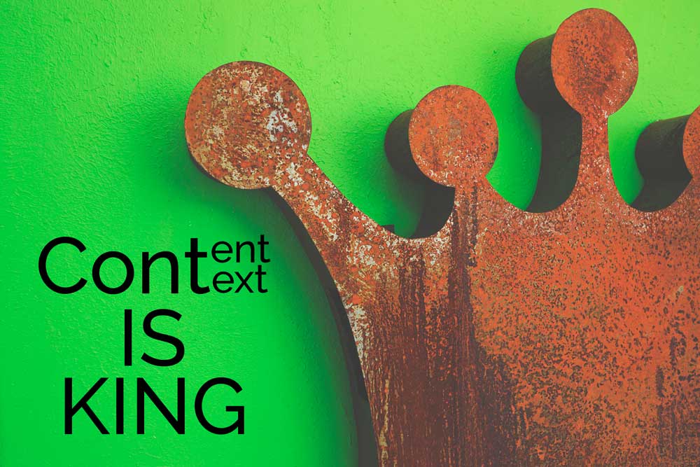
Colour has the power to influence.
By learning about the nature and nuances of its power, you can harness it to build your brand and business for lasting success. The psychological effects colours have on us can be used to create moods, feelings and impressions that become associated with your business through logos, website layouts, product design and marketing materials.
It’s important to keep in mind, though, that the psychology of colour is not an exact science. When an individual experiences a colour, their personal experiences, cultural background, upbringing, and likes and dislikes all have power over their perception. And of course, colour blind people will experience colours totally differently.
That being said, there are identifiable trends associated with different colours.
Green
Green is known as a colour of relaxation and tranquility, likely because of its association with the tranquility of nature. It’s also used in connection with environmental issues for this reason. Harmony and lack of confrontation are other moods aroused by this colour.
Red
Red promotes urgency, making it a popular choice for clearance sales and impulse buys. It physically stimulates appetite, blood pressure and heart rate, as well as creating movement, passion and excitement. An attention-grabbing colour, it gives the impression of efficiency and dramatic dynamics, making it popular with fast-food restaurants such as McDonalds.
Orange
Bold and vivid, orange is women’s least favourite colour, with 33% testifying to their intense dislike of it. Often used for sports teams, it gives the impression of both energy and anxiety. Orange is also the colour for caution, used extensively on safety signs, traffic cones and alerts for weathers and terrorist warnings.
Yellow
Yellow is often associated with the sun, reminding us of light, warmth, summer and happiness. Often seen as a positive colour, it’s been associated with energy, victory and optimism. It’s been proven scientifically that we remember things the best when we read something back from a pastel yellow paper, making it the colour of choice for post-it notes, legal pads and the Yellow Pages. However studies also show that babies cry more when they’re in bright yellow rooms and yellow can provoke anger.
Blue
This is reported as the favourite colour of both men and women, with 57% of males picking blue as their colour of choice. It represents peace and tranquility, and is commonly used in branding to denote reliability, trust and security, making it a popular choice for electronics brands and airlines. It is also an appetite suppressant, so is an uncommon choice for restaurants.
Purple
Women’s second favourite colour choice with 23% of the vote, purple is used to signify beauty, creative energy, wisdom and royalty. Interestingly, 0% of men reported purple as being their favourite colour.
Black
Communicating power, strength and authority, black is often used to communicate important information and create a serious or even professional atmosphere. It is also the colour of sophistication and luxury in branding, as well as mystery and depth. Black might be used to communicate heavy themes, fears, the forbidden and ‘the dark side of life’.
White (shown in black text… for obvious reasons)
White is used to represent cleanliness, purity and safety. It can also signify technology, innovation and a clean slate for creativity. It has a connection with religion, in that it’s thought to represent ‘the good’ and salvation. Other associations include openness and accessibility, as well as an unthreatening nature.
Putting Colour Psychology Into Action
To apply colour psychology to your brand and get the results you want, there are other factors to consider:
Vibrancy
It may seem obvious that brighter colours are more energizing, while pastels and paler colours are more relaxing, but did you know that men prefer the brighter colours while women prefer the lighter versions?
Darker shades are more about ‘drawing in’, and attract men, while women prefer tints, and colours with white added to them.
Knowing if your target market is male or female dominated will help you select the colours that will appeal to your customer base and boost your business.
Colour-brand match
Research has shown that positive consumer reactions are not only based on colour choice, but how well the colour matches the brand or product. The mood of the product and the mood of the colour should match for the best chances of success.
The isolation effect
The isolation effect describes the fact that an image or colour that stands out is much more likely to be remembered than one that blends into the background. Have a blue themed website? Use a bright red or yellow sign up button to build your mailing list. All your competitors using green logos? Try purple to stand out from the crowd.
By getting to know the impact of individual colours, as well as the effects of vibrancy, colour-brand matching and the isolation effect, colour becomes another weapon in your arsenal of marketing tools. With the knowledge of the psychology of colour, you can make better advertising choices to boost your business.